
Reusable Token-to-Code Pipelines for Dual-Theme Design Systems
Component builds against strict system guidelines took a week, so I made the spec precise enough for AI to execute, and build-to-merge time dropped 60%.
Created for one of India’s largest streaming and DTH platforms (under NDA; a flexible drawer component is shown here to demonstrate the methodology).
overview
A scalable design system engine built for a DTH platform
Built a spec-driven generation pipeline in Claude Code that converts hand-built Figma token systems into verified React components.
challenge
Design system guidelines existed but only as documentation, so compliance depended on whoever was building
Components drifted from design, variants duplicated, and theming diverged across products.
try it
Try it. Reconfigure the drawer and watch it rebuild.
Theme
Content
Body
impact & system governance
Enforcing zero-hardcode quality, built-in accessibility, and repeatable scale
Interpreting those guidelines by hand took a week per component. With tokens as the source and an executable spec, build-to-merge time dropped 60%.
100% Token Compliance: Programmatically verified zero hardcoded colours across generated codebases using automated search scripts.
Reduced Code Surface: Consolidated a full variant family into a single configurable API, significantly lowering governance and maintenance overhead.
In-Contract Accessibility & Theming: Baked native accessibility and dual-theme switching directly into the component spec, ensuring first-pass compliance without retrofits.
Upstream Quality Control: Identified and resolved pre-existing Figma token discrepancies at the build-log stage, catching design debt before it reached production.
Repeatable Architecture: Standardised the spec-and-loop framework across the library, establishing a scalable blueprint for all future component generation.
approach
Automating component generation through closed-loop rules and AI specs
Rather than building components manually one by one, I engineered a reusable spec-and-generation pipeline. By feeding hand-crafted Figma token schemas and strict system constraints CLAUDE.md into Claude Code, the pipeline derives verified React components, Storybook stories, and accessibility checks directly from the design spec.
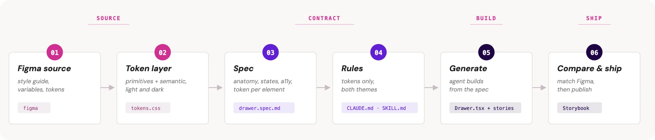
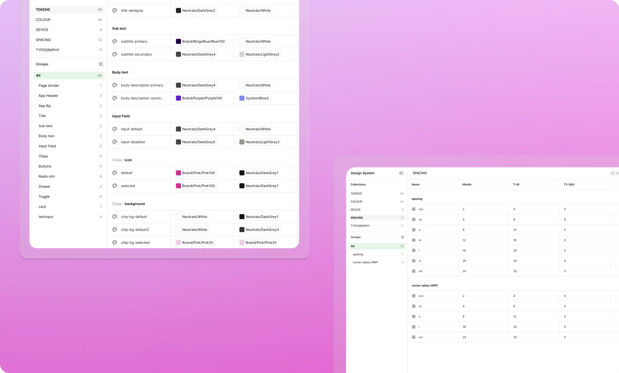
Token Architecture: Hand-built primitive and semantic tokens in Figma; exported to tokens.json and tokens.css with native light/dark mode support in a single layer.
System Rules CLAUDE.md:
Strict constraints injected into every generation pass—zero hardcoded values, strict token usage, single-file component outputs, and mandatory dual-theme compliance.
Reusable Skill (component-from-spec): Encapsulated design rules into a reusable Claude routine that handles component scaffolding, Storybook story generation, and accessibility checks.
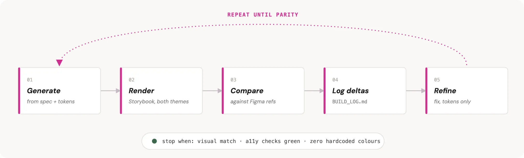
Verification Loop: Visual and token diffing against Figma reference specs, logging deltas directly to the spec until achieving 100% parity.
solution
Replacing static variant sprawl with one flexible API
To demonstrate the pipeline at scale, I consolidated an entire family of static drawers into a single component API. By leveraging flexible props and content slots, this single implementation powers every drawer use case across the application.
| variant | body |
|---|---|
| message | header + buttons |
| confirmation | status icon + header + buttons |
| list | header + cards (icon + title + subtitle) |
| selection | header + description + radio options + buttons |
| edit | header + text input + buttons (keyboard aware) |
| metadata | header + cards |
reflection
What automation changed about the work
Work Shifted from Execution to Quality: Automation streamlined basic visual QA. Design reviews evolved to focus on system intent, moving evaluation to higher-level design judgment.
Exposed Documentation Debt: Design and engineering rules needed alignment and explicit documentation before the automated pipeline could function.
Blurred Role Boundaries: Direct spec-to-code pipelines required design decisions to be production-ready at the spec stage. Lower reliance on late-stage dev adjustments forced design and engineering to redefine ownership and accountability.
Scalability Boundary: This operating model relied on an existing, mature token system. Applying the same framework while standing up design tokens remains an unvalidated edge case.