
Streamlining Clinical Workflows for Precision Cancer Care
How eliminating interface friction delivered 9% faster cancer treatment selection during active patient care.
To comply with non-disclosure obligations, proprietary software names and sensitive clinical data have been sanitised throughout.
TL ; DR
background
Oncology clinicians must document alternative cancer treatments via an "Off Pathway" workflow when standard recommendations don't match clinical needs. This occurs roughly 20% of the time, typically while the patient is in the room.
team
Product Designer (me), PM, Engineering, QE. I owned the research synthesis, redesign, developer handoff, and final validation.
Problem
The interface used one interaction model for three routes that don't work the same way. Selecting a treatment taxed clinicians with work the screen should have carried: working memory, mouse travel, and rebuilt context, in a setting where attention belongs to the patient.
Approach
Match the selection model to the task, scope the panel's accumulator role to the two multi-select routes, guidance-only on the single-select one, without disturbing the patterns clinicians had already learned.
Outcome
Shipped in 2025 across all three selection routes with zero user retraining required.
impact
-
9%
Faster task completion (validated via Pendo analytics and summative testing). In a high-volume clinical environment, these saved seconds compound rapidly—returning valuable time and attention to the patient.
-
0
User retraining
context
What happens when standard treatment isn’t an option
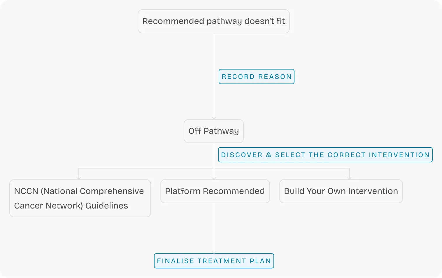
This platform is used to find and document the correct cancer treatments in clinics. When recommended pathways don’t fit (~20% of cases due to insurance, atypical biology, or clinical judgment), they go “Off Pathway”: log a reason, select an alternative, and finalise. This updates the patient’s record and feeds downstream adherence reporting.
Primary User: Oncologists mid-consultation.
Downstream Users: Pharmacy staff who reconcile selections against drug orders, plus care-team and research roles who work from the recorded selection
I was the embedded designer on this team. The problem surfaced from two signals I had direct access to, formative research and customer feedback, and my PM prioritised the fix for the release.
problem
Identifying friction across ‘discovery’ and ‘selection’
The Off Pathway flow can be broken down in 2 phases:

Mapping these routes against phases revealed distinct friction points across the workflow:
| Route | Discovery | Selection |
|---|---|---|
NCCN Guidelines(Single-select) | N/A | Executed multi-item accumulator behaviour and labeled the CTA “Select” in a flow that only permitted one choice. |
Platform Recommended(Multi-select) | List remained completely blank until searched (nothing to browse). | The select control was placed before the row was read and detached from the selection panel. |
Build Your Own(Multi-select) | Buried behind a low-visibility text link. | Opened in a modal that covered the underlying list, completely severing workflow context. |
How these pains were identified:
Formative Research Synthesis: Too many clicks, weak visual hierarchy, and time spent on page that was wildly out of proportion to the decision.
Customer Feedback: Captured direct voice-of-customer signals, where clinicians described these exact workflow blockers in their own words.
impact & outcomes
De-risking the release
Validating design intent across the following sequential quality gates:

Adoption: Zero support tickets and zero retraining requests post-ship.
Attribution Caveat: The 9% efficiency gain measures the combined impact of the browsable list, panel linkage, NCCN scoping, and tab promotion. Isolating individual changes would require staggered rollouts or granular per-interaction Pendo funnels.
approach
Designing for muscle memory
This is a live clinical tool where expert users rely on rapid scanning and repetition. To protect their workflow, I defined the following constraints:
Zero learning curve: Improve the structure without changing the interface.
Surgical changes: Fix only the mapped friction points and leave the rest alone.
Mapping these routes against phases revealed distinct friction points across the workflow:
| Route | Selection model | Approach | Decision |
|---|---|---|---|
| NCCN Guidelines | Single-select | Rebuild around browsing; bind selection to the accumulator. | Shipped a browsable-default fix within existing search; deferred true global search for future exploration. |
| Platform Recommended | Multi-select | Scope the panel strictly to guidance; clarify single-select via copy. | Dropped the accumulator. Keeping it would falsely imply a multi-select workflow. |
| Build Your Own | Multi-select | Convert from a modal to an in-page tab. | Moved inline ensured better connectedness and no context loss |
detailed design
Realigning the interface with user intent
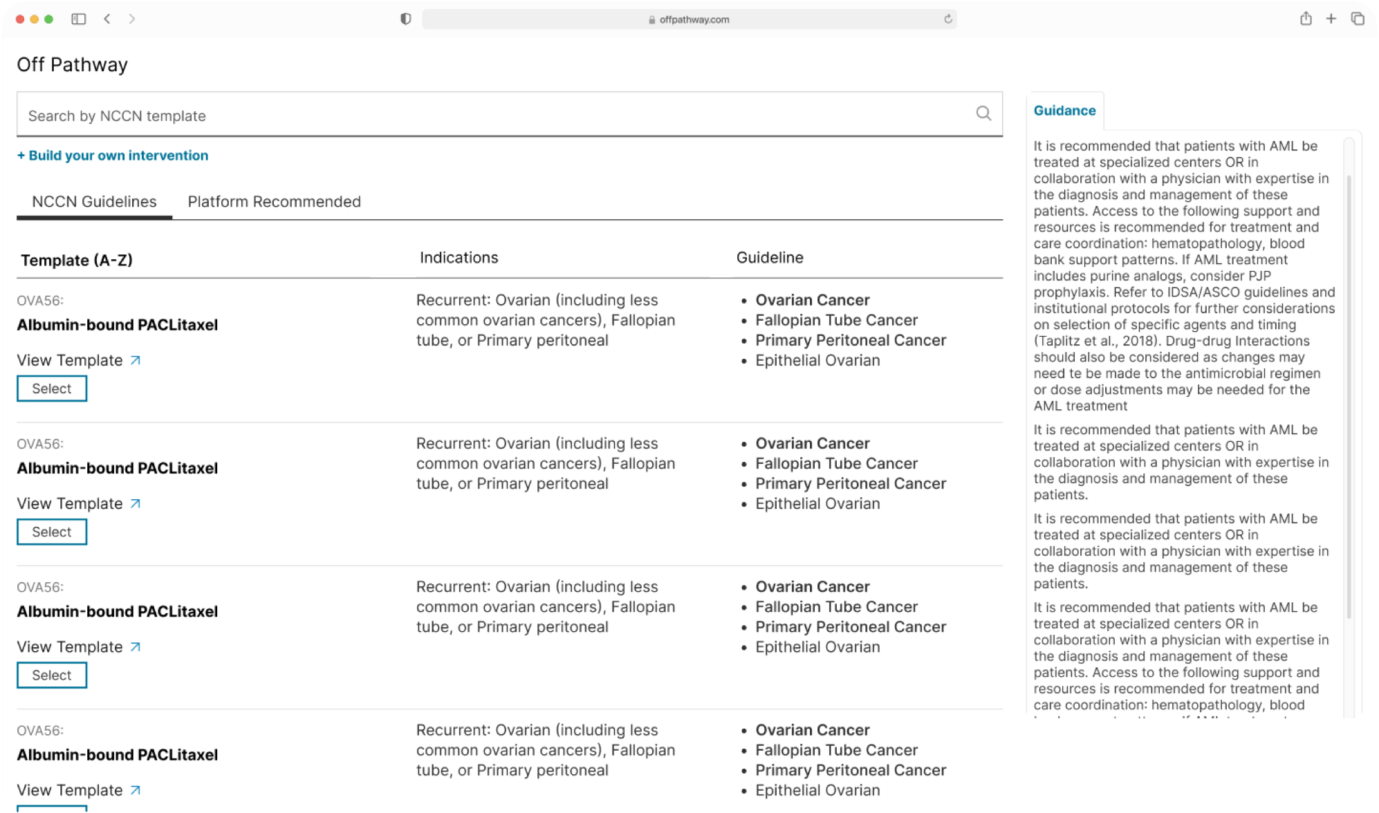
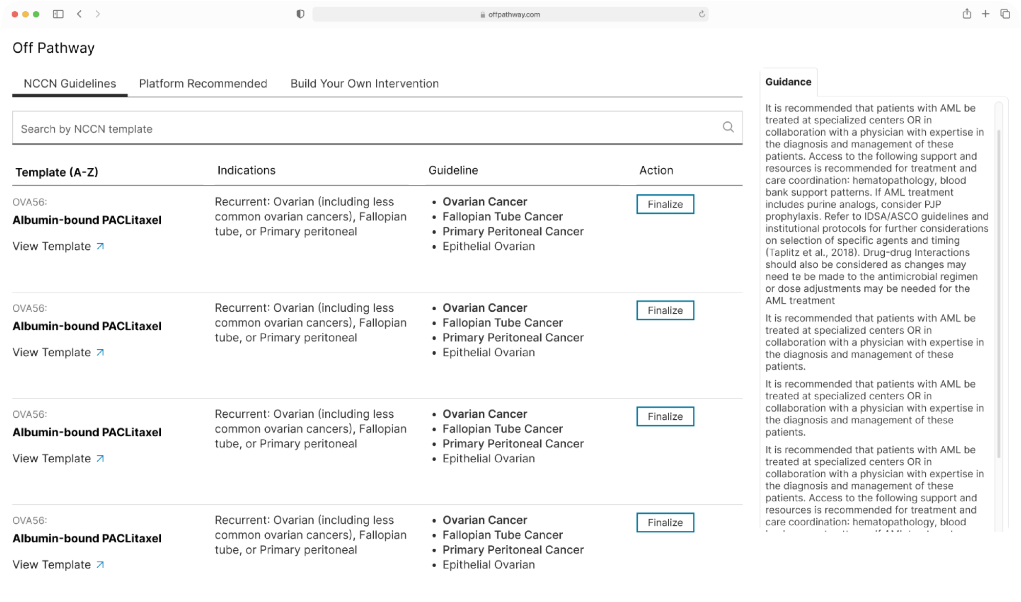
NCCN Guidelines — new: guidance-only panel, single-select list, and Finalise as the terminal action
Discovery:
Search position brought below tabs: for a more logical hierarchy.
Selection:
Signaling a terminal action through microcopy: Changed CTA from what previously was “Select” to now “Finalise.”
Placement of the CTA: Previously placed to the left, now moved to the right, to ease scanning patterns and eliminate back and forth.
Discovery:
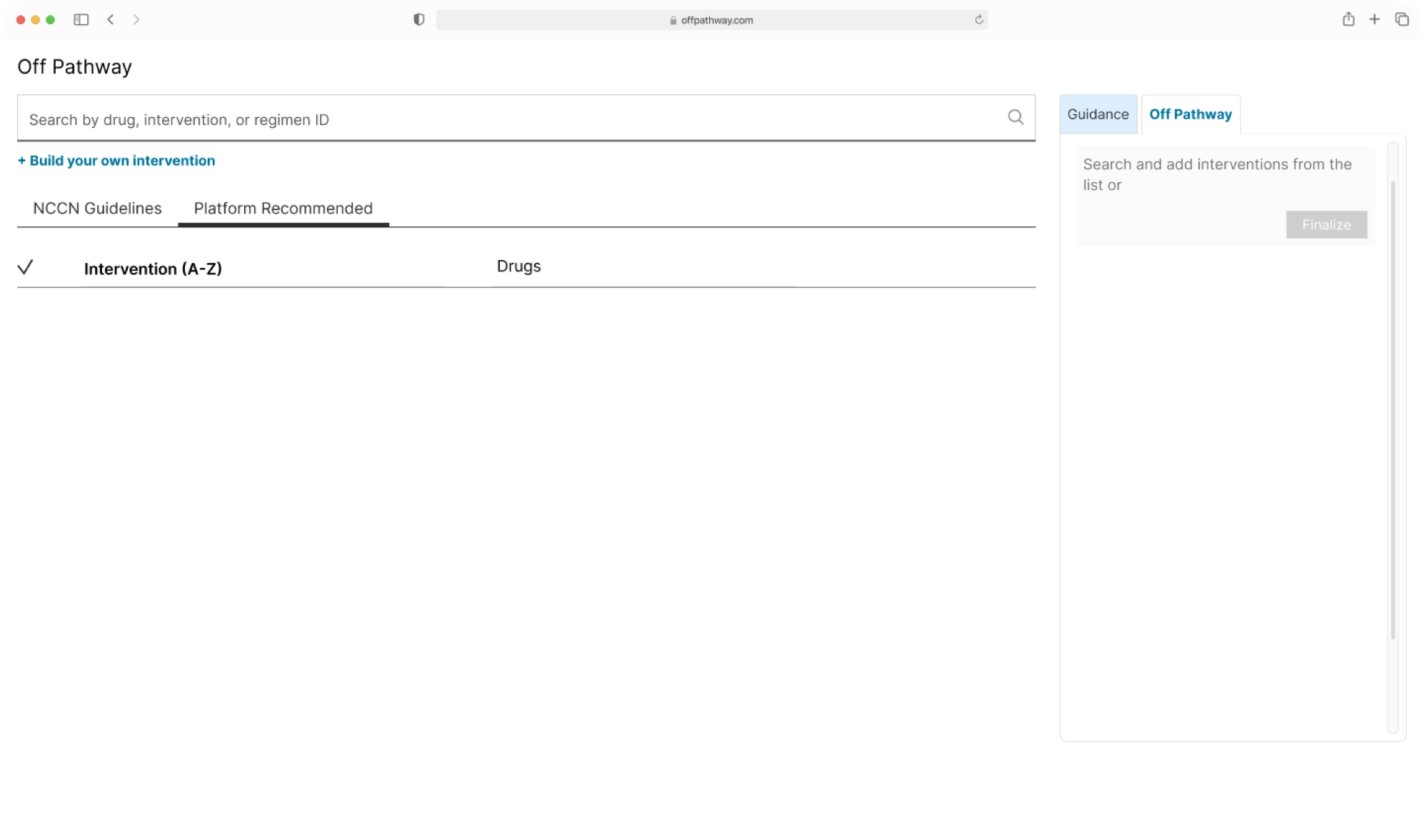
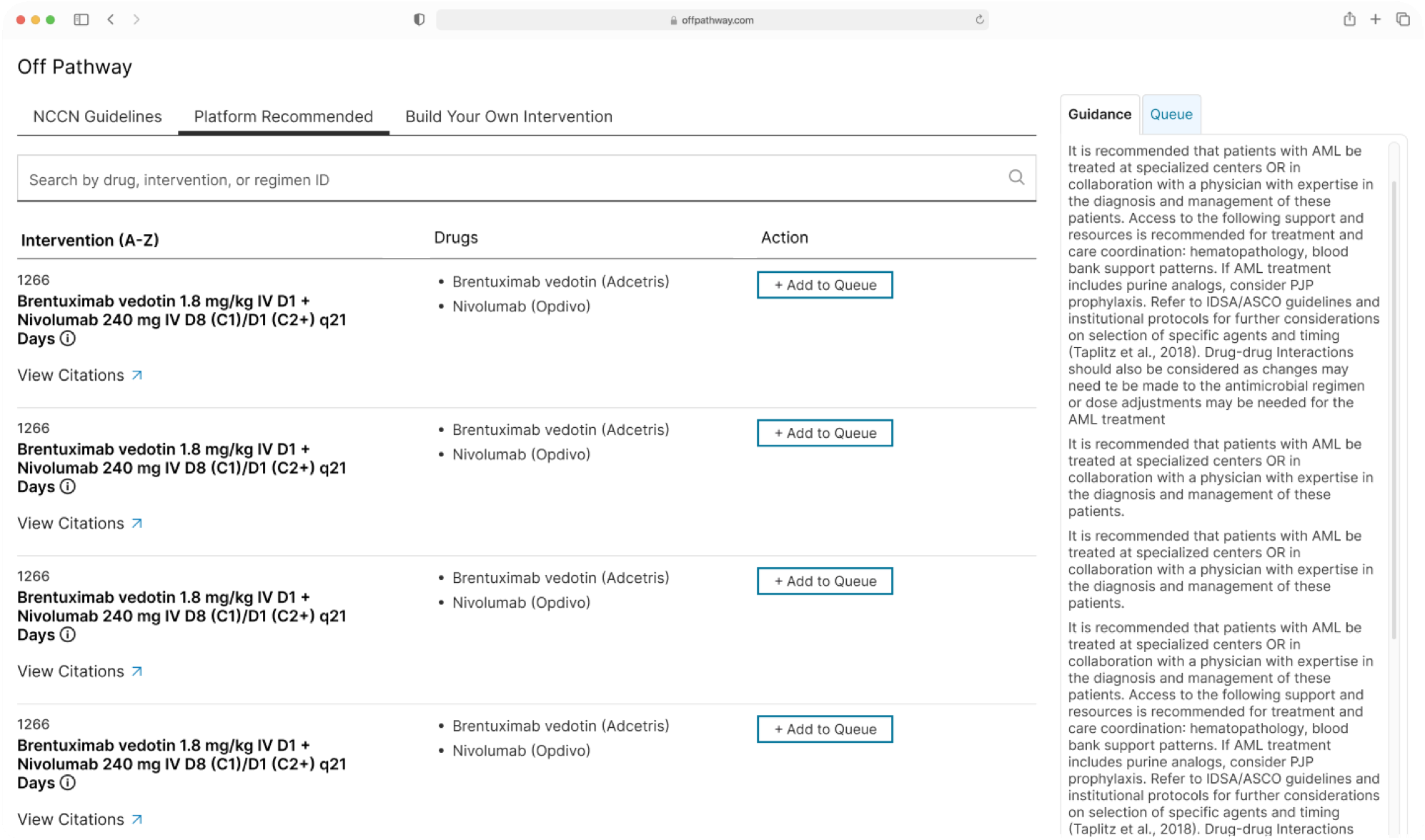
Platform Recommended discovery — new: browsable populated list, Build Your Own elevated to a tab, Add to Queue at row end
Show all by default and allow the user to filter: to ease discovery and not rely on memory.
- Same search bar placement change spoken about in NCCN.
Selection:
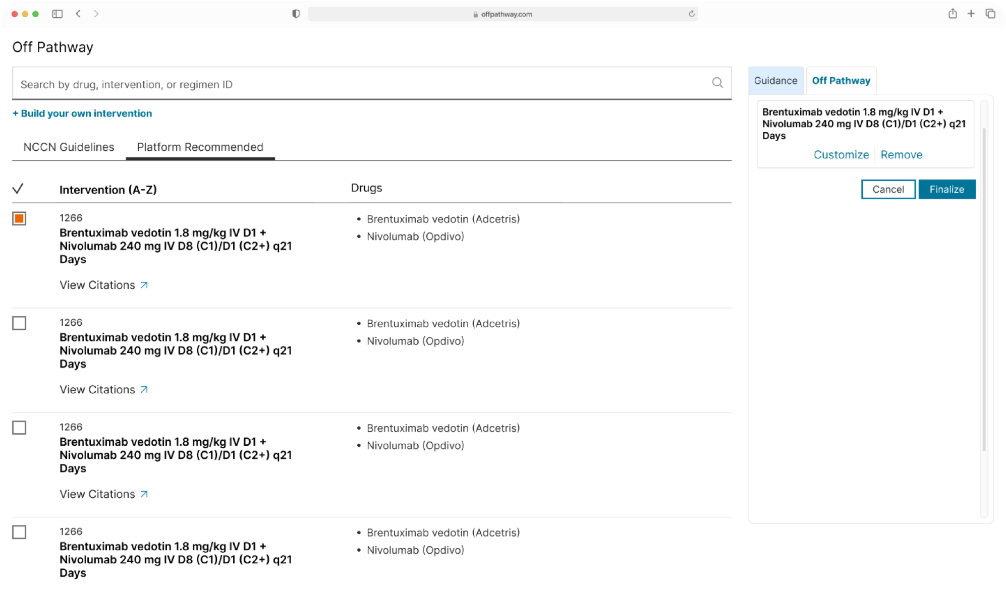
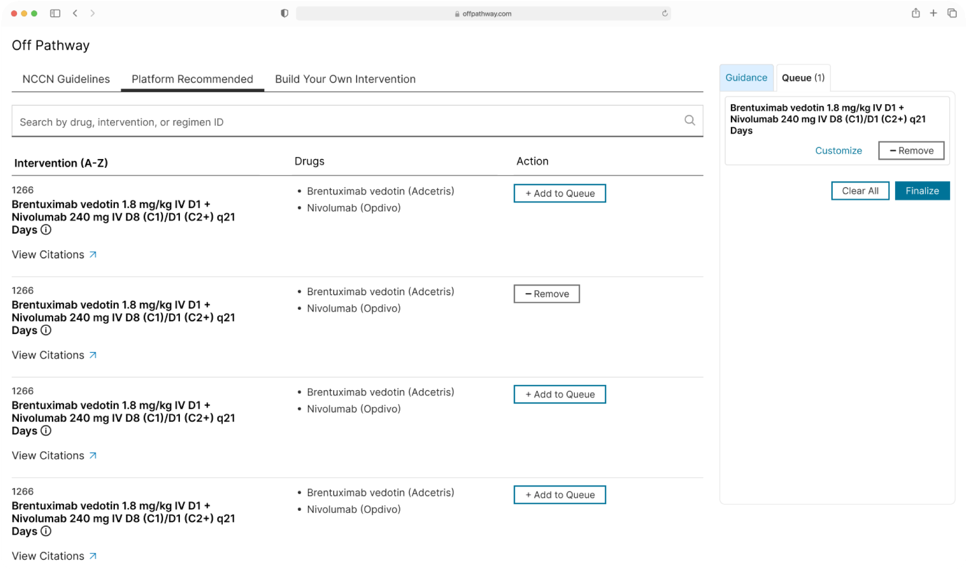
Platform Recommended selection — new: Add to Queue at row end with visual tethering into the Queue panel
The Fix: We replaced the blank state with a populated, browsable list by default, moved the selection trigger to the end of the reading path, and visually tied every selected item to the accumulator panel.
Key Interaction Details (Shared with Build Your Own)
Clearer affordances: Replaced the row checkbox with an “Add to Queue” button, renamed the accumulator tab from “Off Pathway” to “Queue,” and changed “Cancel” to “Clear All” so accumulation and reset intent read explicitly.
Faster scanning: Moved the CTA to the end of the table to follow the reading path and reduce mouse travel.
Visual Tethering: Selected rows visually link directly to their panel entries, making “recognition over recall” a literal layout pattern.
Accessible Affordances: Replaced invisible hover-only zones with explicit info icons that support both hover and keyboard focus.
The Trade-off: Panel density increased. To preserve scannability without breaking the shared global grid, we tightened local spacing tokens instead.
The Fix: Promoted the builder to a dedicated in-page tab. Elevating its hierarchy allowed it to share the guidance panel, accumulator logic, and row-linking pattern of the primary route.
Engineering Trade-off: Refactoring the legacy tab component consumed most of that sprint’s frontend allocation. We accepted the cost because the modal was the single largest flow-breaker in the entire application.
reflection
Restraint and open threads
The Principle of Restraint Designing for live clinical tools demands extreme restraint. To safeguard our zero-retraining outcome, we deprioritised non-essential features and focused solely on high-friction touchpoints.
Key Insight: Aligning UI behaviour with selection models (single vs. multi-select) mattered more than introducing new patterns.
Next Iterations (Unshipped Concepts) Enforce single-selection at the control level rather than surfacing post-action override warnings. Separate route-scoped guidance from task-scoped queue items into visually distinct, weighted zones.